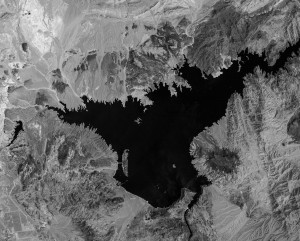
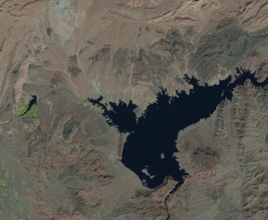
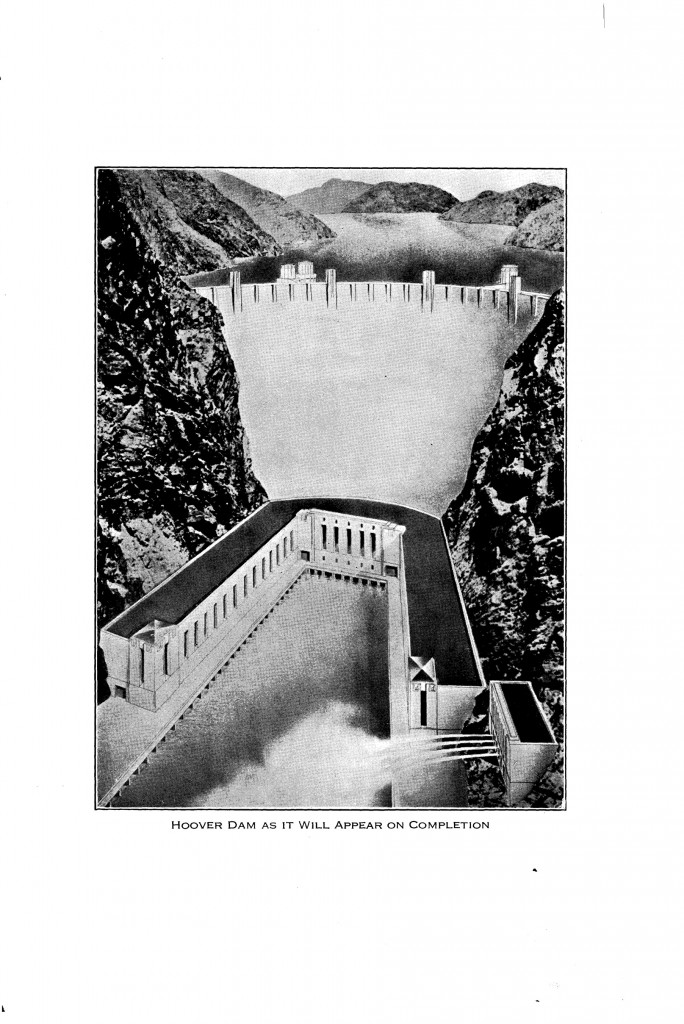
That time Lake Mead was full

Lake Mead, behind Hoover Dam. Undated photo for Historical American Engineering Record survey, courtesy Library of Congress

Lake Mead, behind Hoover Dam. Undated photo for Historical American Engineering Record survey, courtesy Library of Congress

This is part of a Library of Congress collection of photographs taken as part of the Historical American Engineering Record surveys, an amazing body of documentation of America’s built environment. The pictures in this LOC on line archive aren’t dated, but my best guess based on clues (a distinctive URL) is 1987. Mead was close to full that year. I’d love it if any of y’all can suss out other clues to help me figure out if that’s right (lookin’ at you, DG).

Lake Mead Then and Now

I don’t have any pictures from the same vantage point from my most recent trip, but here’s one from the same side, a bit up river and looking back toward the intake towers, taken in February. If I’m right about the dates, Mead’s surface elevation was between 1,205 and 1,210 feet above sea level in 1987 when the above picture was taken. When I took mine in February, it was somewhere around 1,089, 120 feet lower. It’s currently at 1,078, more than 10 feet lower than when I took this picture:

Hoover Dam, February 2015, by John Fleck

Hoover Dam, February 2015, by John Fleck

Here’s another of the HAER images, taken by photographer Jet Lowe, with an angle similar to my shot to allow a better comparison:

Hoover Dam, HAER, by Jet Lowe, courtesy Library of Congress

Hoover Dam, HAER, by Jet Lowe, courtesy Library of Congress

One key lesson (in addition to the fact that we’re using too much water downstream) is that Jet Lowe is a much better photographer than I. But it’s hard to take a bad picture of Hoover Dam.

Phoenix subsidence and groundwater pumping

A new paper by Megan Miller and Manoochehr Shirzaei at Arizona State describing subsidence in the Phoenix area offers some interesting new data for thinking about the implications of groundwater management. Subsidence is bad, and groundwater pumping is what causes it. Having the ground surface drop is bad all around, cracking building foundations, messing up roads, and such. What’s interesting about the Miller and Shirzaei paper is that it shows subsidence continuing long after groundwater overdraft stops. Here’s the key figure:

Groundwater levels (blue triangles) and surface elevation (red dots). From Miller, M. M., and M. Shirzaei (2015), Spatiotemporal characterization of land subsidence and uplift in Phoenix using InSAR time series and wavelet transforms, J. Geophys. Res. Solid Earth, 120, doi:10.1002/2015JB012017.

Groundwater levels (blue triangles) and surface elevation (red dots). From Miller, M. M., and M. Shirzaei (2015), Spatiotemporal characterization of land subsidence and uplift in Phoenix using InSAR time series and wavelet transforms, J. Geophys. Res. Solid Earth, 120, doi:10.1002/2015JB012017.

This is data from four key areas where the authors were measuring the earth’s surface rising or falling. The red dots are earth’s surface (rising in two areas, dropping in the other two) plotted against the levels of the underlying aquifer, which is rising in all four areas. As the authors explain, central Arizona, the area in and around Phoenix, pumped the hell out of its groundwater through most of the 20th century. That began to reverse with the passage of the state’s Groundwater Management Act in 1980, and there’s good evidence that in the decades since the overpumping has been reversed (see for example this paper from 2010 by a couple of USGS researchers which found 80 percent of the Phoenix area’s wells either stable or rising, and this one from the USGS’s Leonard Konikow, which also shows recovery in southern Arizona aquifers coinciding with the years after the GMA’s passage).

What’s interesting here is the wonky technical discussion of aquifer pore spaces and compaction that leads to the conclusion that subsidence is continuing in some areas even though the aquifer is rebounding.

The Economist gives Las Vegas points for water management

The notion of using “Las Vegas” and “sustainable” in the same sentence might give a lot of westerners the heebee jeebees, but there’s an interesting case to be made that its water management decisions over the last decade have pointed it in that direction. The Economist, in a look at Vegas water performance in its latest issue, doesn’t use the “s” word, but gives Vegas high marks for getting its water management house in order:

To the casual observer, with most of the West parched, Las Vegas’s water use seems astonishingly wasteful. Visitors flying in see acre on acre of suburban houses, a good proportion of them with pools. Those staying on the Strip find abundant fountains, enormous swimming pools and palm-lined boulevards, all in the middle of the desert. And yet beneath this mirage, quietly, Sin City has proven remarkably effective at managing its water, even as its population booms.

Talking to some folks today who are working on Colorado River water issues, I trotted out the Las Vegas example because the issue The Economist keyed in on is so interesting to me. Vegas looks crazy water wasteful. But the underlying numbers are actually kind of encouraging. Vegas water use and population data is another example of the “decoupling” I’ve been writing about – water use dropping even as population, economic growth, ag productivity, etc., rise. Here’s some of the data I’ve assembled in research for my book, which shows the water use curve bending down, significantly, after 2002, even as population has continued to grow:


Las Vegas Colorado River water use


Vegas and Candide

A colleague who’s been helping me think about these issues has been properly cautioning me against Panglossian optimism. (In fact, this colleague literally bade me read Candide so I would understand the fallacy of my “Panglossian optimism”. It’s a short book, and the university library a two minute walk from my office offered a choice of translations. I love my new academic posting.) I sometimes get sloppy with my “when people have less water, they use less water” argument, as if the sort of adaptive capacity that happened in Las Vegas is inevitable. This is not, in fact, the best of all possible worlds, as Candide so painfully discovered. But neither is the sort of pessimism, the we’re-completely-doomed rhetoric around Western water management that makes a lot of our current water policy rhetoric sound like Candide’s downer of a traveling companion Martin. (The scenes of Candide and Martin’s trip from South America back to Europe are like a hilarious pastiche of a journalist’s 2015 road trip through California’s Central Valley. “Why, then, was this world formed at all? asked Candide. To drive us mad, answered Martin.”)

These examples of adaptive capacity I’m trotting out, of “decoupling”, are a sign that solving our water problems is tractable, and that there are examples of how one might succeed. But it’s not inevitable. Lake Mead’s still kind of empty.

At the end of the book, Candide realizes that the important thing is to tend your garden.

Real time water meter data causes people to use more water, not less

The idea of installing smart water meters is in vogue these days, with the idea that water users, if made more aware of how much water they’re using all the time (rather than just when they get their monthly bills), will use less:

In the spring of 2005, the City of Aurora, Colorado offered residents the opportunity to purchase Water Smart Readers (WSR). WSR are monitoring devices that provide households with real-time information on water consumption but not price information. The hope of this policy, from the utility?s perspective, was to make households more aware of their water consumption leading to, ideally, a reduction in water use. Real-time information policies are becoming more common as part of larger efforts by utilities to improve system-wide efficiency and more effectively manage demand.

That’s Aaron Strong and Chris Goemans in a weirdly counter-intuitive (to me at least) new paper, The impact of real-time quantity information on residential water demand. This seems obvious to me, that more information will make us smarter and therefore efficient water consumers.

Not so, Strong and Goemans found in their review of the Aurora data. Smart meters tended to increase water use in Aurora.

Here’s their explanation. Aurora is one of many U.S. cities that has implemented “increasing block rates” – low rates for basic water use, then rising rates per unit water used if you’re more profligate. What they found the smart meters do is help users realize when they’re over or under the block. If they’re a bit over, the smart meter helps them conserve to drop down to the lower priced block. This saves water. But for users who aren’t close to the level where their use would bump them into the higher block, the additional information seems to make them comfortable using more water: “Hey, the longer shower isn’t a big deal, because it’s not enough to bump me up into the higher block.”

After the device is installed, households become aware of where, within the price structure, they are consuming. On net, the average consumer increases water consumption but those that decrease, decrease enough to jump under block boundaries.

The paper has lots of caveats, so this shouldn’t be the last word on smart meters in the water world. But I love results that run counter to my beliefs and expectations.

The hidden value of the California drought

Brett Walton:

The value of the California drought, painful as it is, is that the state’s citizens are beginning to ask the sorts of questions that might previously have been confined to a conference room. Who gets water? How much? Who decides? What is valuable – economically, socially, ecologically – about rebuilding a wetland, or planting an almond orchard, or watering a lawn? Can competing interests produce joint benefits?

Drought brought these questions to the surface. The dry hot days hurt now — for the homeowners without running water, for the farmers who must fallow fields, and for the fishermen who see their catch disappearing — but the pain will be beneficial later. If the state pays heed.

Imperial, Coachella, and the Salton Sea, from Gemini V, August 1965

Imperial County crop report, 1965

Imperial County crop report, 1965

The Imperial County Agriculture 1965, one in a series of reports I’ve been reading on the history of ag production in the California desert, has an insanely cool picture on its cover that sent me down the NASA rabbit hole. It’s kind of grainy, a picture of Imperial from space labeled “Gemini V Official NASA Photo”. The picture, poor as the reproduction is, sent me on a search for an original.

The Gemini V mission launched Gordon Cooper and Pete Conrad into orbit on Aug. 21, 1965. They stayed for nearly eight days, setting what was then a record in our competition with the Soviets for who could set milestones for doing stuff in space.

They took some pictures, including this breathtaking image. Pictures from space frequently tell useful stories. Imperial has always seemed especially so to me, because of the way the vantage point of orbit shows the crisp line between desert and irrigated farmland, one of the most striking examples of what geographers call a “working landscape”. The farmland to the right is the Imperial Irrigation District, the body of water in the center is the Salton Sea, and the farmland on the left is Coachella.

The image in the NASA archive is undated, so we only know that it was taken between Aug. 21 and 29, 1965:

Imperial Valley, as seen from Gemini V, August 1965, courtesy NASA

Imperial Valley, as seen from Gemini V, August 1965, courtesy NASA


Decoupling water use from growth: the New Mexico example

Pulling together some New Mexico water use numbers today for one of my University of New Mexico colleagues, I was reminded of a cool paper from a few years back by Peter H. Gleick and Meena Palaniappan of the Pacific Institute that contained this striking graph:

Water use and GDP

Water use and GDP

It’s two times series – U.S. gross domestic product and total water use – plotted side by side. As Gleick and Palaniappan note, the two rise “in lockstep” through most of history – as the nation grows, both in population and economic activity, so does its water use. But in the 1970s, the curves decouple. Our national economy has continued to grow, but our water use has not. Increasing population and economic activity no longer requires more water.

In the research I’m doing for my book, I see curves that look like this all the time. I’m more frequently looking at population growth rather than total economic activity, and I’m often slicing up the data to look at groundwater versus surface water withdrawals, municipal versus agricultural use, and ag water use compared to ag productivity. But looking at this in lots of different ways, I almost invariably find some sort of decoupling.

New Mexico water

Here’s today’s decoupling – municipal water use in New Mexico:


New Mexico municipal water use

This particular USGS dataset is “public supply”, which is essentially all the state’s major municipal water agencies and captures 85 percent of the state’s population. Municipal use peaked in 1995. In Albuquerque, the state’s largest metro area (and site of my own backyard rain barrels), per capita use looks like it’ll be about half this year of what it was back then. If you add in agriculture (which in New Mexico uses ten times as much water as municipalities), New Mexico water use peaked in 1980. Both groundwater pumping and surface water diversions have been declining ever since, even as our state’s population and economy has grown. In inflation-adjusted terms, New Mexico’s ag sector was about the same size in 2010 that it was in 1980 (data from BEA), but it’s using a million acre feet per year less water. That’s a big part of how “decoupling” works.

Finding these points of decoupling and looking at the hydrologic and policy drivers is one of my new hobbies (where by “hobby” I mean “book research”), because they point to examples of what solutions to our problems might look like. If I can generalize, it’s the relatively straightforward notion that when people have less water, they get clever about using less water to get stuff done. Municipalities facing scarcity get the conservation bug, and farmers are just plain smart about adapting when they have less water to work with.

Arizona water

Arizona is a particularly interesting example. Despite a reputation for groundwater management problems, its groundwater use peaked in 1975, according to the USGS, and is now barely more than half of what it was then. A big part of that is the substitution of surface water from the Colorado River, but groundwater use has dropped more than replacement use of surface water has risen. Arizona’s 1980 Groundwater Management Act has its problems, but by this important measure (and others, especially rising aquifers in key parts of the state) it seems to be working. An annual reduction of  more than 2 million acre feet per year in groundwater pumping seems like kind of a big deal. Phoenix, to cite one example, used to get nearly all of its water from groundwater. Now it gets almost none, switching from mining ancient and non-renewable groundwater to renewable surface water supplies.

Arizona groundwater


According to the USGS data, Arizona’s overall “peak water” moment (ground + surface water) came back in 1980. Arizona’s population has more than doubled since then, and it’s using 25 percent less water, even with those crazy “misters” people install at outdoor restaurants and backyard patios to try to make Phoenix summers bearable.

This “when people have less water, they use less water” thing is one of the lines of evidence that makes me optimistic about our ability to solve our region’s water problems if we can identify the characteristics that make it work and harness them in the cases where we’re still having problems.

Note on sources: The data for my graphs (and also the one in the Gleick/Palaniappan paper) is the USGS water use report series.

Water governance is weird, PVID-MWD democracy edition

How is it that residents of Southern California’s urbanized coastal plain (sort of) have voting rights in an irrigation district clear across the state? Pull up a chair….

At its Aug. 17 meeting, the Water Planning and Stewardship Committee of the Metropolitan Water District of Southern California takes up this item:


Let’s follow the governance chain here. MWD, which wholesales water to some 20 million residents of the Los Angeles-San Diego metro areas, is made up of 26 member agencies. Some of them, like Pasadena and Los Angeles, directly serve retail water customers. Others are wholesalers in their own right, municipal water districts that in turn pass water along to more than 200 smaller retailers. The board is made up of representatives of each of the 26 member agencies with members’ voting rights proportional to property valuation.

The Palo Verde Irrigation District delivers irrigation water to farmland around Blythe, along the Colorado River. There, elections are held for a board, with voting rights allocated in proportion to property ownership.

MWD owns 22,000 acres of land in Palo Verde, about one sixth of the land. So MWD gets 22,000 acres worth of voting rights in Palo Verde. Thus the residents of California’s great coastal cities, in proportion to their pro rata share of MWD governance, get a corresponding pro rata share of PVID governance.

This makes my head hurt.