An excellent Laura Paskus story this weekend on a new climate water risk study by Justin Mankin at Lamont-Doherty and colleagues, includes some really important comments from Mankin on the implications of the work for water policy.
The study helps clarify risks to water supply in the Rio Grande (and elsewhere, notably the Colorado River Basin) as a result of climate change. Here’s Laura’s summary:
Decreasing snowfall and rainfall will put many western water supplies at risk in the coming century.
The authors drill down to the seasonal scale and look at risk to both rain- and snow-supplied water supply, with current water use as their benchmark. Both the Colorado and Rio Grande basins are at high risk of shortfall, they found.
For the Rio Grande, writes Mankin, “it is highly likely that both spring and summer snowmelt will decrease at the same time that spring and summer rains will decrease.”
Slicing up the data to look at water supply at these fine scales is a valuable contribution. In Laura’s story, Mankin makes a really important point, though, about the limitations of their work:
Although the authors planned for continued increases in population, he says that water consumption by those populations could change due to conservation, efficiency, or other technological changes.
“Humans have a great deal of agency in this picture of water availability moving forward,” says Mankin. “We have a really long history of providing water to people during periods of atmospheric shortfall.”
This gets to a shortcoming in the science we’ve been doing in our efforts to come to grip with the implications of climate change for water supplies that I’m finding increasingly frustrating. Work like Mankin’s reflects an increasing sophistication in the modeling of available water on the supply side. But there’s a shortage of similar research underway on the demand side.
Water problems are the product of the relationship between the two.
In their paper, Mankin and colleagues frame the issue thus:
The likelihood that population growth and economic development increase human water demand in the future implies that our analysis provides a lower bound on the risks that global warming will present to snow resource potential, as increasing population and/or per capita consumption will further increase the total amount of water required to meet human demand.
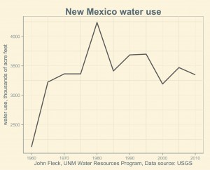
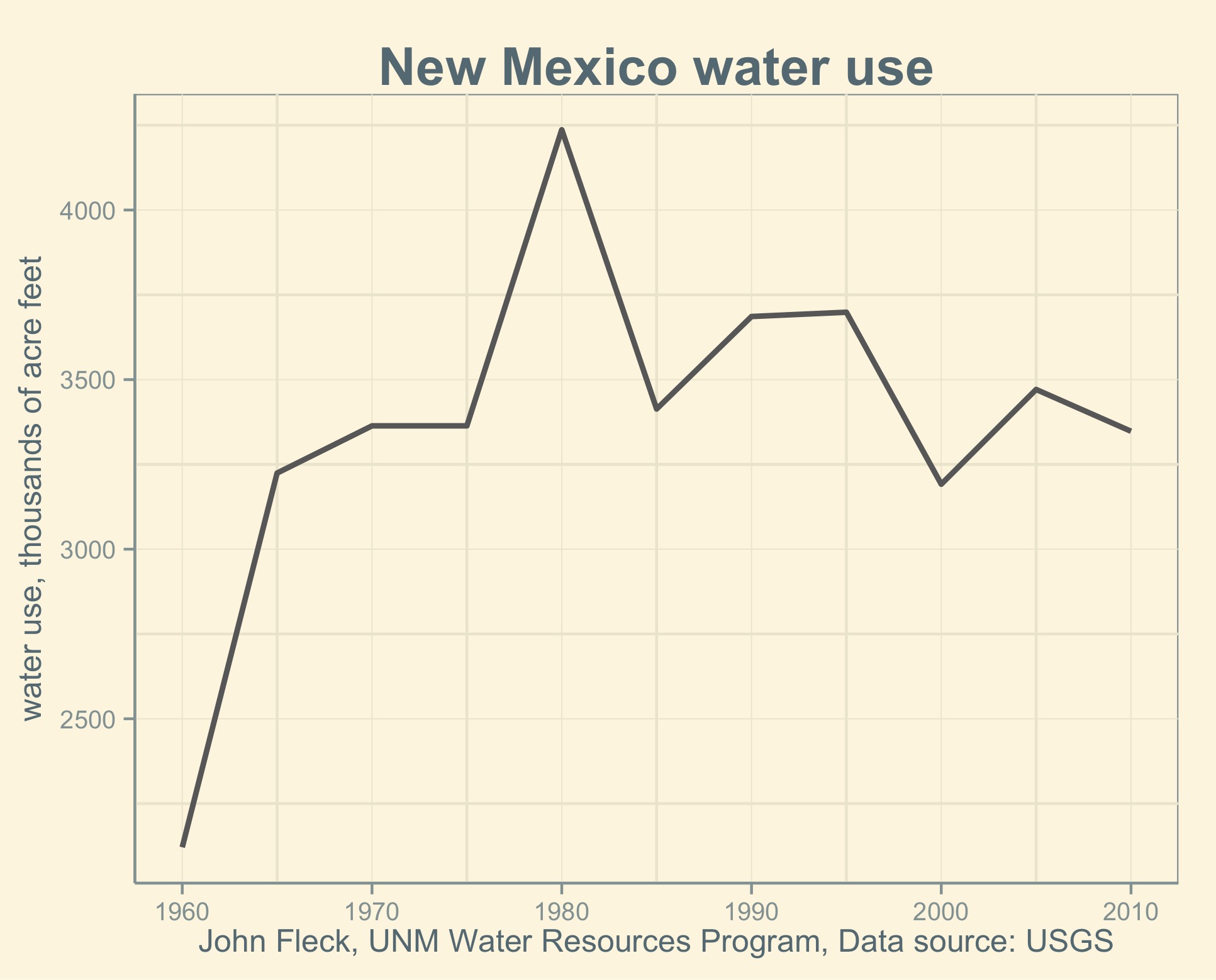
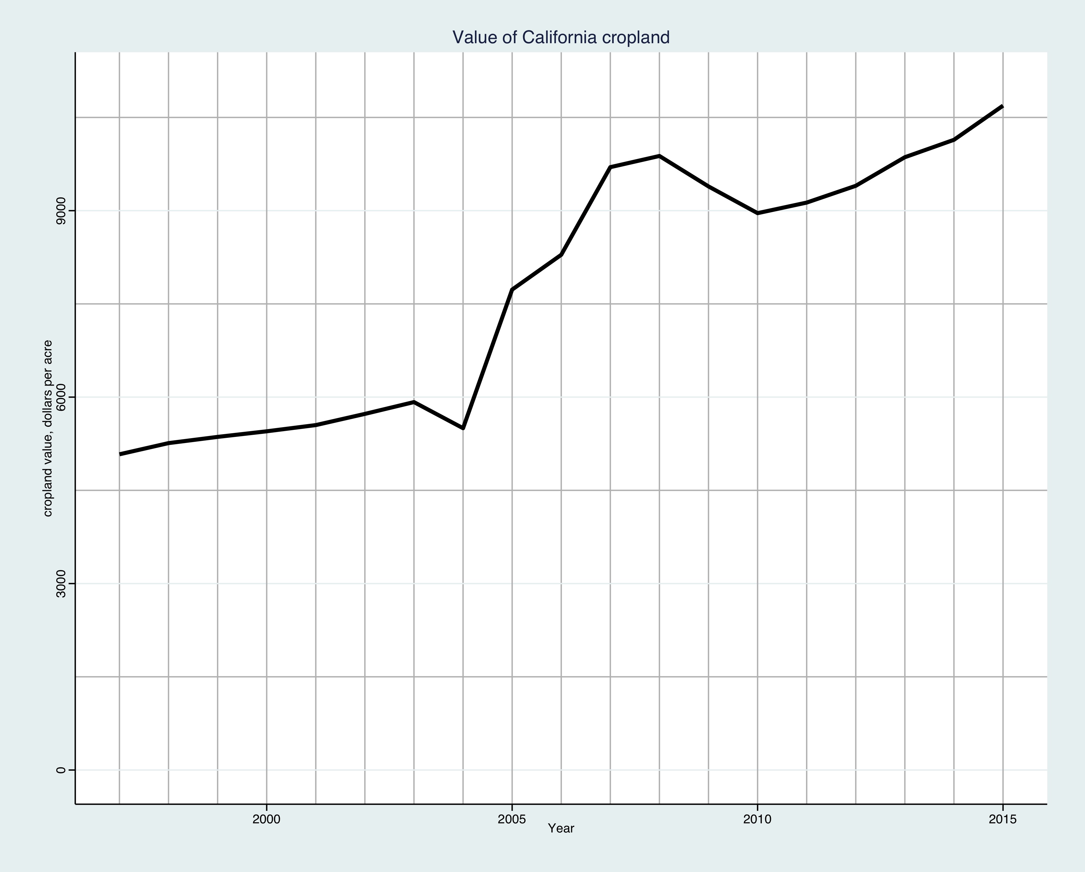
New Mexico water use, data from USGS
This is the common assumption, but I’m not sure that it’s right. Peter Gleick and Meena Palaniappan, in a 2010 paper that I love to cite, point out that U.S. population and economic growth decoupled from water use around 1980. Since that time, water use has been flat. In New Mexico, a Rio Grande basin community implicated in the shortfall risk cited by Mankin, water use peaked around 1980 and has declined 20 percent in the decades since, even as population has doubled. The New Mexico data is frustratingly coarse, so it’s hard to know whether our water use has bottomed out, or whether I’m making a mistake in citing 1980. (In my graph, the 1980 spike looks weird. Bad data?) Certainly in the municipal water sector we don’t seem to have bottomed out. Albuquerque’s water use is declining again this year, something that seems to be the case in other big cities I’m looking at across the Southwest. Phoenix and Las Vegas both seem to have peaked in 2002 and have seen a substantial decline in water use since then, even as their populations have grown. There also are signs that we’re seeing a reduction in ag water usage.
In the U.S. Bureau of Reclmation’s recently published “Moving Forward” report looking at municipal water use needs in the Colorado River Basin, there’s a remarkable moment of clarity on this point in the discussion of municipal water use in Arizona:
Despite a 29 percent increase in the number of homes, total deliveries to single-family residences in Maricopa County were 2 percent lower in 2013 than in 2000. Tucson Water’s 2013 deliveries to single-family residences in 2013 equaled deliveries in 1989. Demand has become decoupled from population, and the downward trends will almost certainly continue for some time to come (Woodard, 2014b).
(The “Woodard” there is Gary Woodard, formerly of the University of Arizona and now at Montgomery and Associates in Tucson, with whom I’ve had useful recent discussions on these points.)
David Katz at the University of Haifa published an interesting paper this year trying to get at the underlying issue. It talks about what economists call an “environmental Kuznets curve”, a situation in which some environmental variable (pollution, resource use) rises as populations get more affluent until wealth reaches a certain point, after which the curve bends. At that point in an EKC, increased wealth leads to a decrease in environmental stress – less pollution or resource use. Is water use subject to an EKC? Woodard’s data (and my own) suggests, empirically, that something of that sort is going on in the western United States. Katz’s analysis, looking across the developed world, suggests something more mixed.
The uncertainties I mentioned above (municipal use seems to be dropping, as does agricultural use) are incredibly important, and I’m frustrated that I don’t have Mankin-style analyses of the demand side on the Rio Grande or Colorado River basins to draw on to help me understand that half of our supply-demand risk. What if we’re at (or past) an inflection point in the western water use EKC? What are the supply-demand implications?
As Katz notes in the classic concluding line from every truly interesting research paper, “Further study is in order.”