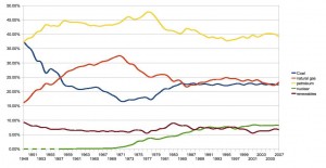
I’d been curious about what this graph might look like. From EIA:
(Source: EIA – click through to see it bigger)
The interesting thing is that the U.S. energy mix largely stabilized, in terms of the share of total consumption from the main sources, in the late 1980s, and has been relatively unchanged since. Why is this? Did it essentially converge on a stable economic optimum? What role, if any, did government policies have on the shape of the our energy mix pie chart over time, both in arriving at the post-1980s equilibrium and before?
I don’t know whether this graph is telling us anything profound, but as we head into what is billed as a serious attempt to change our energy mix in dramatic ways, it’s worth thinking carefully about what federal policies, if any, have had the ability to shape our energy mix in the past.


John,
This is a very interesting graph. Thanks.
I think that petroleum means ‘cars and trucks’
Natural gas and coal mean electricity and home heating.
Nuclear means electricity and may decrease fairly soon as nuclear plants go out of service and are not replaced.
My guess is that, at least many years ago, renewables means hydroelectric.
It is interesting, in the short term, how little effect wind or solar is likely to have on this graph, especially since the total energy is 97 quadrillion btus per year, far more than solar or wind are likely to produce and the equivalent of, probably turning the entire planet into a corn field (I am guessing at this number)
It converged because the price of oil in real dollars steadied and that set the base.
OK, Eli,
I’ll take the bait.
Why, given terrorism and its emotional impact on the price of oil, did the price of oil stabilize? And, are prices from $60 to $147 a barrel for West Texas crude ‘stable’?
Second, why would the price of nuclear, renewables, natural gas, and coal be pegged to oil? It would seem to be against a company’s self interest to peg their prices to the price of oil, especially with the terrorist boost to oil prices not applying to the other energy sources.
Curiouser and curiouser.
It seems that the graph conceals more than it reveals.
Oil prices were low for a long, long time – since the mid-80’s. (The rise in gasoline prices was below inflation for years and years.) Oil prices have fluctuated a lot lately, but it takes time and investment to build the infrastructure necessary to use other forms of energy (whether for transportation or electricity).
And, ummm, have we really had any serious attempts to change the energy mix in the past 28 years? My impression has been that Reagan pretty much shut down any changes that had started in the 70’s.
What Kim said pretty much. As long as the price of oil was low and could go even lower if the Saudi’s turned on the spigot no one was (or is) going to invest seriously into alternate sources of energy.