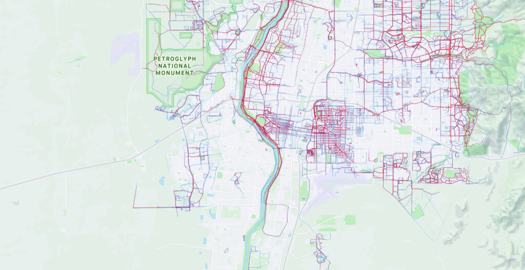
Poor folk don’t jog?
The reflection of socioeconomics in Strava’s running heat map for my town is striking. It’s sort of Tiebout sorting?
Poor folk don’t jog?
The reflection of socioeconomics in Strava’s running heat map for my town is striking. It’s sort of Tiebout sorting?
Poor folk time and means are tied up in staying alive.
Poor folks just running to keep from falling behind.
Sorry but I’m a bit dense. What exactly is this map showing? Do the red lines represent jogging areas in this lower-income area of Albuquerque or Rio Rancho, whichever it is?
I understand what the map is trying to indicate. However, as a former geography major, map librarian, and map cataloger, I’m reminded of the one thing I learned in cartography class 50+ years ago: every map needs a legend.