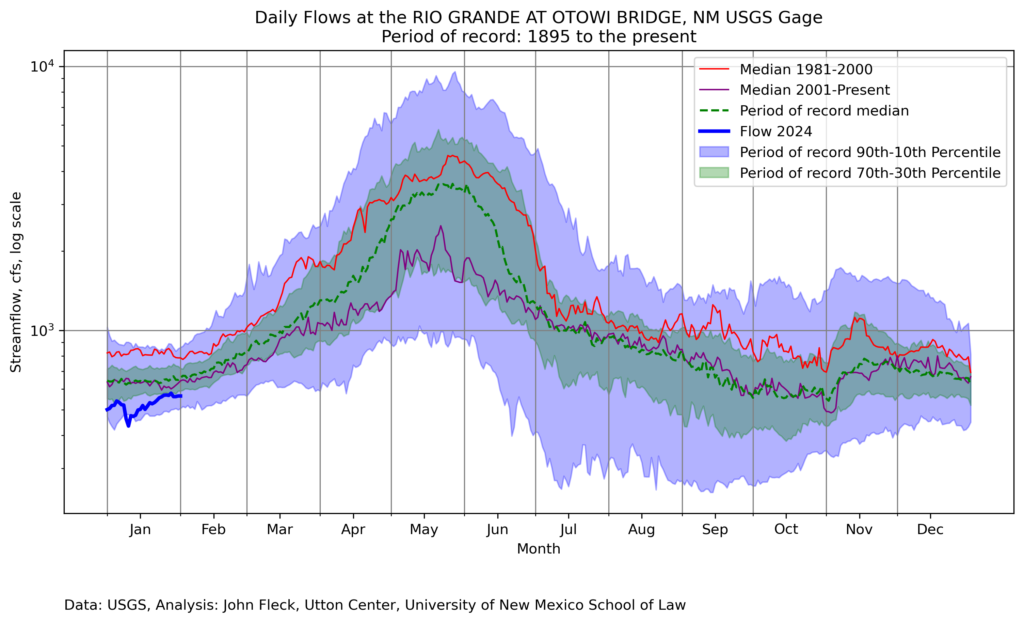
I’ve been updating the crufty old code I use to generate graphs to help me (and colleagues) think about river flows.
This one’s a little busy, so maybe for specific nerd colleagues’ use, and not general consumption?
It’s based on a request from a friend who uses these, and asked for a visualization of the wet 1981-2000 period compared to the drier 21st century. This is an important comparison given that a whole bunch of New Mexicans (including me!) moved here in the wet 1980s and ’90s, which created a sense of what’s “normal.”
It’s important to note that this is not a measure of climate, at least not directly. This is a measure of how much actual water flows past the Otowi gage, which is a product of:
- climate-driven hydrology adding water
- trans-basin diversions adding water (“trans basin diversion” singular, I guess, the San-Juan Chama Project)
- upstream water use subtracting water
- reservoir management decisions moving water around in time (sometimes reducing the flow by storing, sometimes increasing it by releasing)
I get so much out of staring at these graphs. A few bits from this one, which I did a few evenings ago curled up with my laptop in my comfy chair:
- Look at the curves around Nov. 1 – a drop as irrigation season ends, following by a rise as managers move compact compliance water down the river to Elephant Butte. Makes me curious about what they were doing back in the ’80s and ’90s in November.
- This year’s winter base flow is low.
At some point soon I’ll get the updated code onto Github, but it’s not quite ready for sharing. (I’m rewriting it in Python, because learning is fun!)
Thanks to the supporters of Inkstain’s crazy busking business model.

