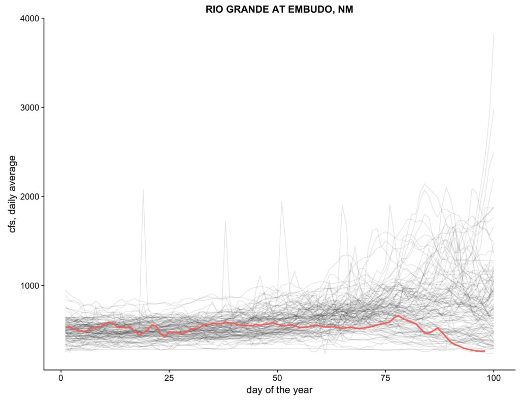
Experimenting with some data visualizations to try to help make sense of where this very dry year on the West’s rivers fits into historical context, I came up this morning with this:

The spaghetti is daily flow for each year in the USGS historic record for the gauge at Embudo in northern New Mexico – the oldest gauge in the country, with a nearly continuous record back to 1895. The red line is this year.
I’m not sure this visualization works for a general public audience, but for me it did the trick.
As you can see, at this point in the year, the river should be rising as snowpack melts. It’s dropping. And a quick glance at the graph showed that this year is, in fact, historic – the second driest at this point in April on record.
Code here.

Great plot. Spaghetti plots convey a lot of useful information. It might be nice to also plot the median (which, undoubtedly, follows the darker cluster) and some upper and lower percentiles, say the 95th and 5th percentiles. Clearly there are other years with low daily average CFS measurements, but the spaghetti plot obscures their trajectories. Thanks for sharing.