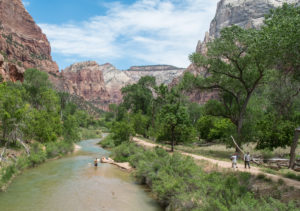
Virgin River, Zion National Park
Driving back this week the long way from Las Vegas, Lissa and I were stunned by Zion National Park. The river was high, the rocks were red, and the people were everywhere.
I’m guessing it’s been 50 years since my first Zion camping trip, with Mom and Dad and Lisa and one of those big canvas tents. I’ve been back many times since, but not for 15 or 20 years. Lissa and I stayed in St. George and drove up for the day. Mindful of the Park Service warnings, we parked outside the park, in the little town of Springdale, and rode the shuttle bus to the park entrance.
Zion is magnificent, beautiful narrow canyons carved by the Virgin River and its tributaries from the geologic layer cake of the Colorado Plateau. You can see why lots of people would want to come here, and I am not one to complain about the crowds. I go to cities for fun all the time, where there are lots of people. But when I turned to the visitation data on our return to St. George, I was frankly stunned.

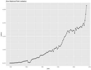
Source: National Park Service, graphed by me
If you believe the data from the Park Service’s visitor use database, visitation to Zion has risen 52 percent in the last three years, topping 4 million people in 2016. That’s a huge step function beginning in 2014, almost too big a jump to be believed.
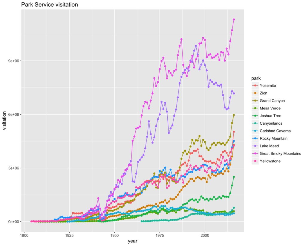
Zion is not alone, according to the Park Service data. Joshua Tree, Canyonlands, Rocky Mountain National Park all saw increases of more than 50 percent. I only poked around randomly looking at parks that interested me, so my look at this data is in no way comprehensive, but here’s a graph of all the parks I pulled the data for. I apologize for the clutter, Prof. Fleck would grade his students off for posting a graph this busy, but look at all those hockey sticks!

Park Service visitation
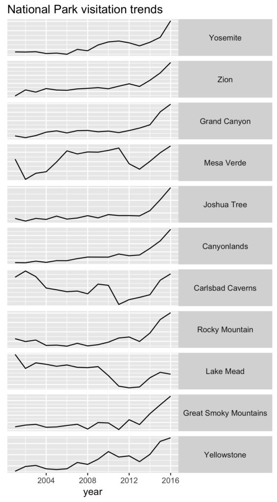
 Here’s another attempt at a visualization, a tiny multiples graph showing each of the parks I looked at from 2000 to the present, without vertical scale and a non-zero baseline, just to get a feel for the shape of the curve for each park. You can see that every park save Lake Mead (a National Recreation Area, not a “park”) has a jump beginning in 2014.
I posted some of the graphs on Twitter and mused about what might explain it, and my friends pitched in with a host of hypotheses:
- a change in data collection or reporting methodology – maybe they’re counting differently?
- a surge in foreign visitors (lots of those cramming into the Zion shuttle buses with us were thus)
- a boom in baby boomer retirement travel
- publicity around the Park Service centennial (and maybe, related, the Ken Burns PBS documentary)
- the drop in gas prices that began in 2014 (this matches up better date-wise than the centennial or Ken Burns hypotheses)
- Instagram! This is my favorite, the idea that we’re seeing all our friends’ pictures on Instagram and Facebook and the like, stoking demand for that picture perfect vacation, so we wanna go too. We saw a lot of selfie action.
It’s interesting to think how one might test these hypotheses. The more I look at the graphs, with that sharp jump in 2014 in so many parks, the more I think we need to start with the first hypothesis – some sort of data methodology change. But it doesn’t take much googling to discover active conversation in the communities around the parks that suggests some amount of the increase is real.
By the time we hitched the shuttle back to our car after a day of hiking Zion’s crowded trails, Springdale looked like on long narrow parking lot that ran for miles. Not hard to see why people want to come, but it’s a bit of a mess as a result.
update: Shawn Regan linked to a post he wrote a couple of years ago that there has been a long steady decline in National Park visitation, dating back to the 1980s, when looked at in per capital terms. I updated the data here – long steady climb in visitation by this measure from the 1960s through the late 1980s, then a steady decline. That decline appears to have reversed in the last few years, but still has not come close to its 1980s’ peak:

per capita park visitation

Maybe people want to get a last glimpse before the parks are paved over with asphalt.