I’ve had my head down the last ten days reading and writing about 1940s and ’50s-era Los Angeles water management, and I look up to see that Lake Mead last week dropped below elevation 1,075, a level freighted with meaning. But what meaning, exactly? Drew Beckwith at Western Resource Advocates, in Caitlin McGlade’s story, wins for quotability:
“This is the check-engine light,” Beckwith said.
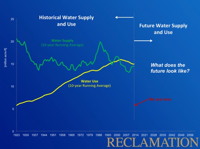
I agree. But rather than start with the usual imagery of the bathtub ring, let’s start with some engine diagnostics, courtesy of a talk the U.S. Bureau of Reclamation’s Terry Fulp gave today as part of an on line series organized by the Consortium of Universities for the Advancement of Hydrologic Science:
The green line is scary as hell, as is the gap between green and yellow. We’re using more water than the system seems capable of providing. But if we’re going to make sense of the decline in Lake Mead, we also have to think through why the yellow line, the line showing water use in the Colorado River Basin, is bending down.
The L.A. history stuff I’ve been working on for my book is a chapter about the development and evolution of water management institutions Southern California’s “West Basin” (beachy cities like Santa Monica and inland communities like Hawthorne and Inglewood). I’m using it for two reasons: first, it’s an example of a collective water management regime in a group of communities that successfully confronted shortage. The result was a transition from a rapidly dropping aquifer to an aquifer that was healthy enough to provide a drought buffer when later dry times hit. How did they do that? Secondly, I’m using it because it’s where Elinor Ostrom did her thesis, and a) she is awesome, and b) her thesis is a gold mine for a storyteller. (spoiler alert: squabbling mayors)
The basic message, seen time and again in arid western North America, is that people tend to speed recklessly toward the water supply cliff, but when they near it, they almost inevitably hit the brakes. It would be great if we weren’t so reckless in the speeding part, but that seems to be an inevitable result of historical contingency, the problem of path dependence, and human nature. Blame our historical selves if you must, but whatever. That’s done. The key here is the “hitting the brakes” part.
So what bent the yellow curve down?
The first thing is the undertold story of the reduction in California’s Colorado River allocation. Up until 2002, California regular was allocated more than 5 million acre feet of water from the river, for use in desert farming and urban/suburban communities. In 2002, it peaked at 5.3 maf. In 2003, that was cut to 4.4 maf. In response, Southern California showed remarkable adaptive capacity with conservation, conjunctive ground-surface water management, innovative ag-to-urban transfers and a bunch of other stuff. (Buy my book! As soon as I quit with all the blogging and write the damn thing!)
The second thing is just same old same old in the Upper Basin. As Mike Cohen likes to remind me, when you’re up at the headwaters part of the system without a big reservoir above you, when there’s less snow in the mountains above you, you use less water. “Shortage” is a normal part of variability. These people have the “adaptive capacity” already built in.
There are two common themes that emerge here. The first is a boundary condition: once the water gets scarce, people use less water. The second is the nature of the adaptive capacity, which is a bunch of fuzzy social and human and institutional stuff that you’ve got to be able to call on to either succeed or fail when the boundary condition whacks you upside the head and says, “Yo, less water this year!” It’s that adaptive capacity (the ability to pivot to conservation, or ag-urban transfers, or some such) that determines whether you succeed or fail.
The yellow line on Terry’s graph suggest we’re already stomping on the brakes, but yellow is still above green, meaning water use still exceeds supply. What can we learn from the stuff that’s already working to help us step on the brakes a bit harder?
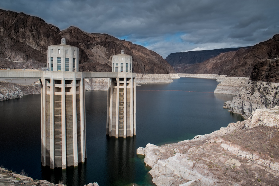
With that out of the way, here’s the obligatory picture of the bathtub ring, with bonus ominous sky:


“(Buy my book! As soon as I quit with all the blogging and write the damn thing!)”
OK, I’ll gladly buy your book at a book-signing site of your choice…but I’m not getting any younger (or smarter), so get it done!
🙂
It would be instructive to add actual use in addition to the 10 year running average: a running average necessarily incurs a lag (5 years for 10 year running average), unless you do a centered average, in which case you shift the yellow curve to the left 5 years (bringing the end point to 2009. Either way, as presented it is hard to see what we had the last 10 years, or what the trend is currently.