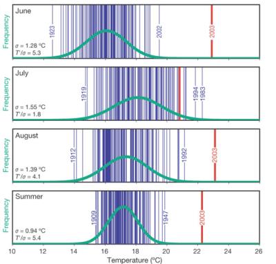
Those of you who lived through the summer of 2003 in Europe know it was what might be called, in statistical terms, “an outlier” – 20,000 dead’ll do that. But it wasn’t clear to me just how much of an outlier until I read this paper by Christoph Sch?r et al. in the Jan. 22 Nature.
The paper’s a great example of the difference between the more conventional phrase, “global warming”, and the more useful and accurate way of looking at things – “global climate change”.
Sch?r and his colleagues looked at the statistics of how warm it had been, using a good long-term temperature time series from Switzerland ? 12 sites with temperature records going back to 1864. In general, temperatures fall into what statisticians call a “normal distribution” – a lot of numbers on and around the average value with fewer and fewer cases the farther you get from the mean, an arrangement that creates the classic bell curve.
When the Swiss scientists plotted the summer of 2003 against the historical record, it showed up as being off-the-chart weird:

Those big bright lines on the right are most assuredly not “normal”, in either the practical or the statistical definition of the word. Exactly how weird? Sch?r et al. estimate a return period, based on the old climatology, of 46,000 years, give or take a whole bunch. They’re cautious about that statistic: “This large return period should not be overstated, and is here merely used to express the rareness of such an extreme summer with respect to the long-term instrumental series available.”
So what’s going on here? Well, clearly what happened last summer is more than just the whole graph getting pushed to the right because the whole place is getting a little bit warmer. What’s really going on, they suggest, is an increase in variability. That means a wider dispersion from the mean of temperatures. That is exactly what the climate models predict, and that seems to be what happened in the summer of 2003.

Pingback: jfleck at inkstain » Blog Archive » Second Flowering