Dontcha just love libraries? Nothing quite like the serendipity of finding something unexpected on the shelf next to the thing you were looking for.
On my mission to better understand statistics, I was at the downtown Albuquerque library Saturday going through all the stale, musty old stats textbooks when I stumbled up on Edward Tufte’s Visual Display of Quantitative Information.
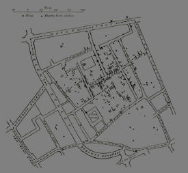
Tuft tells the story of John Snow, a London physician in the 1850s who removed the handle from the Broad Street pump and halted a cholera epidemic that had killed half a thousand.
He did it, Tufte argues, by making a map:
Deaths were marked by dots and, in addition, the area’s elevent water pumps were located by crosses. Examining the scatter over the surface of the map, Snow observed that cholera occurred almost entirely among those who lived near (and drank from) the Broad Street pump.
Snow had the handle removed from the Broad Street pump, the cholera stopped, and epidemiological history was made.
I’ve heard the story before, and always loved it – the power of a simple idea, and a map. Only it turns out it’s not true. Several years ago, a group of scholars went back through the record to figure out what Snow really had done and not done. The results of their work, published in The Lancet three years ago, show that Snow had been working for some time on the Cholera problem, and had suspected contaminated water as the cause based on a number of other outbreaks in London. In each case, they tended to be confined to users of a single water system, always one drawing from a part of the Thames contaminated with sewage. (This is one of those scientific ideas that seen like a “doh” today, but really required great insight at the time – remember they didn’t really have a concept of “germs” yet.)
“The map” was one of a number he drew while working on the problem, and none grew out of a flash of inspiration, arising instead out of a lot of long hard work.
Snow’s Broad Street cholera work is unquestionably a scientific tour-de-force, but it did not arise, as the myth would have it, out of sitting down in a single afternoon and drawing a map.
Doesn’t change for a moment my thinking about Tufte’s book, though. It’s terrific.


I believe it is in that same book (or one of Tufte’s) that he shows the visualization of Charles Minard’s map of Napolean’s army in the Russian campaign. It can be seen here with an explanation:
http://it.coe.uga.edu/studio/seminars/visualization/minard.html
He also has a picture presenting train schedules, although I never found it too appealing. Techniques like this are incredibly useful, but also are very difficult to come up with in general. You (usually) have to be able to find a way to represent high-dimensional data visually, which generally requires in depth knowledge of the field being studied. For example, visualizations of tornados can very easily become useless as you need to only show the useful information, where useful depends on what behavior you wish to study. Many “pretty” pictures can be entirely useless in practice (3D, rotating, color images for medical imaging are a good example of this — they can obscure important information and generally aren’t needed), while some “ugly” pictures are very useful (black and white 2D slice of an organ in question). Data visualization is a fun field!
This is one of my favourite anecdotes from any of Tufte’s books. Nice post.